library(tidyverse)## Warning: ³Ì¼°ü'tidyverse'ÊÇÓÃR°æ±¾4.0.3 À´½¨ÔìµÄ## -- Attaching packages --------------------------------------- tidyverse 1.3.0 --## √ ggplot2 3.3.3 √ purrr 0.3.4
## √ tibble 3.0.3 √ dplyr 1.0.5
## √ tidyr 1.1.2 √ stringr 1.4.0
## √ readr 1.4.0 √ forcats 0.5.0## Warning: ³Ì¼°ü'ggplot2'ÊÇÓÃR°æ±¾4.0.5 À´½¨ÔìµÄ## Warning: ³Ì¼°ü'tidyr'ÊÇÓÃR°æ±¾4.0.3 À´½¨ÔìµÄ## Warning: ³Ì¼°ü'purrr'ÊÇÓÃR°æ±¾4.0.3 À´½¨ÔìµÄ## Warning: ³Ì¼°ü'dplyr'ÊÇÓÃR°æ±¾4.0.4 À´½¨ÔìµÄ## Warning: ³Ì¼°ü'stringr'ÊÇÓÃR°æ±¾4.0.3 À´½¨ÔìµÄ## Warning: ³Ì¼°ü'forcats'ÊÇÓÃR°æ±¾4.0.3 À´½¨ÔìµÄ## -- Conflicts ------------------------------------------ tidyverse_conflicts() --
## x dplyr::filter() masks stats::filter()
## x dplyr::lag() masks stats::lag()BankChurners <- read_csv("data/BankChurners.csv")##
## -- Column specification --------------------------------------------------------
## cols(
## .default = col_double(),
## Attrition_Flag = col_character(),
## Gender = col_character(),
## Education_Level = col_character(),
## Marital_Status = col_character(),
## Income_Category = col_character(),
## Card_Category = col_character()
## )
## i Use `spec()` for the full column specifications.ggplot(BankChurners)+geom_bar(aes(x=Customer_Age,fill=Attrition_Flag))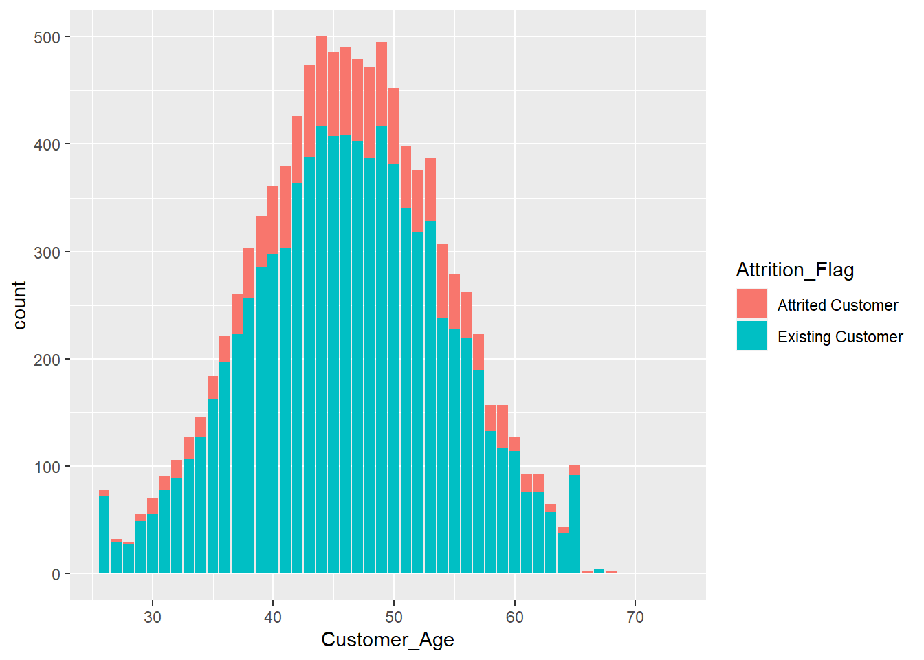
f1 <- BankChurners %>% ggplot(aes(x=Total_Trans_Ct,fill=Attrition_Flag)) + geom_density(alpha=0.6) + labs(title='Total Transaction Count vs Attrition Customers')
f1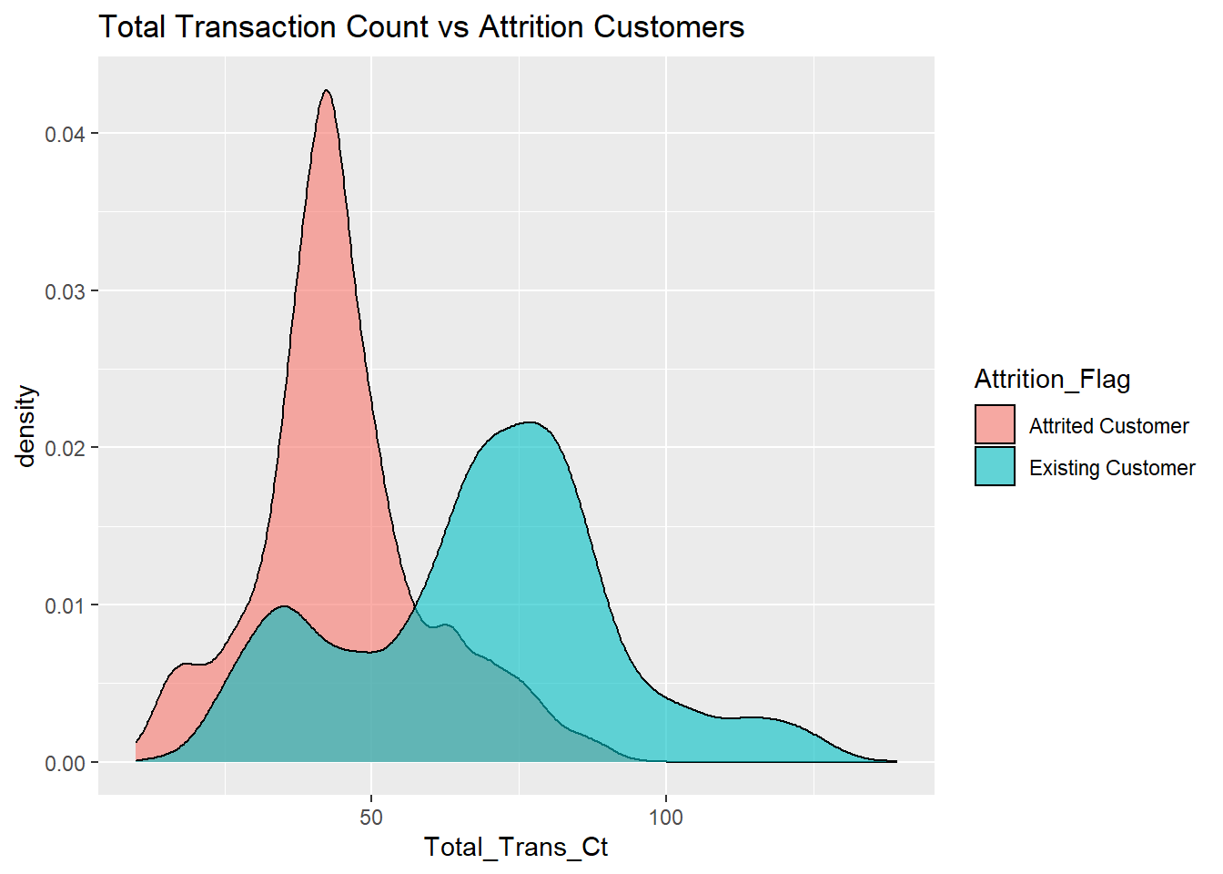
f2 <- BankChurners %>% ggplot(aes(x=Total_Revolving_Bal,fill=Attrition_Flag)) +
  geom_density(alpha=0.6) + labs(title='Total Revolving Balance vs  Attrition Customers')
f2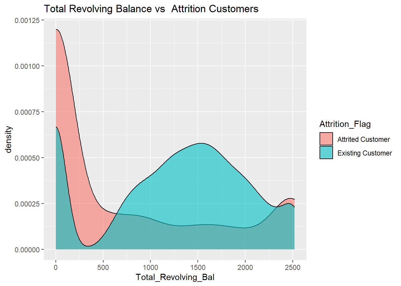
f3 <- BankChurners %>% ggplot(aes(x=Avg_Utilization_Ratio,fill=Attrition_Flag)) +
  geom_density(alpha=0.6) + labs(title='Average Card Utilization Ratio vs Attrition Customers')
f3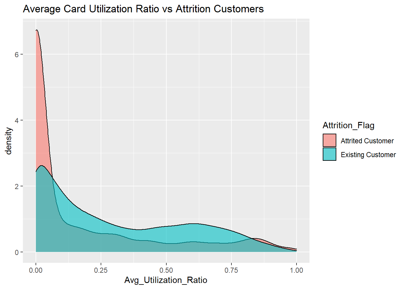
f4 <- BankChurners %>% ggplot(aes(x=Total_Trans_Amt,fill=Attrition_Flag)) +
geom_density(alpha=0.7) + labs(title='Total Transactions amounts vs Attrition Customers')
f4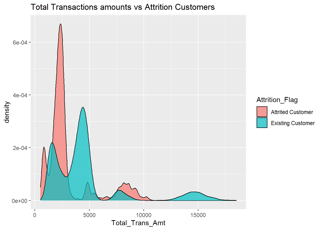 From the graph, we see that the majority of the existing customers are 40-50 years old. There seems to be a normal distribution among customers’ age range. Also, from age of 0-40, the number of churning customers increases as customer age increases. At the age of 40-50, it has the most attrited customers. After this point, the number of attrited customers starts to decrease. Age could play a role in why customers are churning.
ggplot(BankChurners)+geom_bar(aes(x=Education_Level,fill=Attrition_Flag))+coord_flip()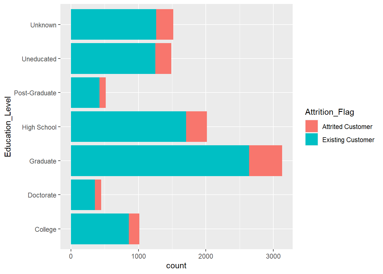 There really doesn’t seem to be a relationship between education level and the number of people that churned. The attrited customers seem to be evenly distributed around different education levels. So the education factor does not seem to be a liable one.
ggplot(BankChurners)+geom_point(aes(x=Education_Level,y=Months_on_book,color=Attrition_Flag),position="jitter",size=0.5)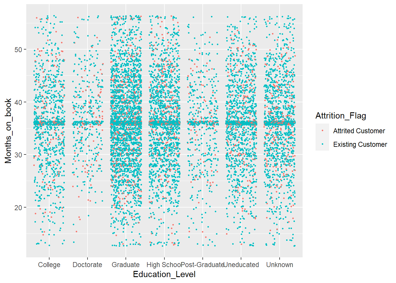
ggplot(BankChurners,aes(x=Credit_Limit, y= Customer_Age,color = Attrition_Flag))+geom_point(alpha = 0.2)+facet_wrap(~Income_Category)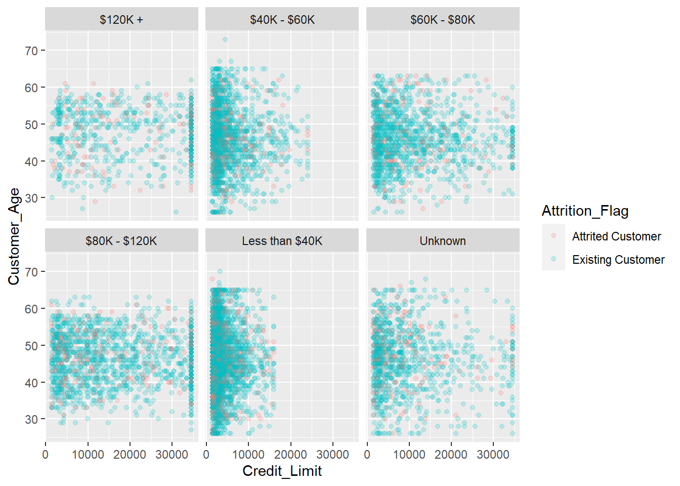 We assume that there will be a positive relationship between credit_limit on the credit card and customer’s age in a year. However, it is hard to see any obvious trend from the graph above. We can tell that the annual income and people’s credit limit on credit card may have a positive correlation because the group with lowest annual income (less than $40K) has more proportion with credit_limit less than 10000, while group with highest annual income ($80K -$120K) has more proportion with Credit-limit greater than 30000.
ggplot(BankChurners,aes(x=factor(1), fill=factor(Education_Level)))+geom_bar(width = 1)+facet_wrap(~Income_Category)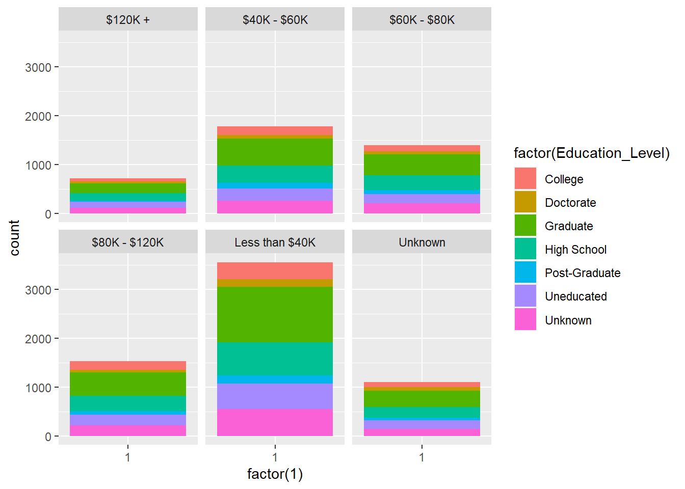
ggplot(BankChurners,aes(x=factor(1), fill=factor(Attrition_Flag)))+geom_bar(width = 1)+facet_wrap(~Income_Category)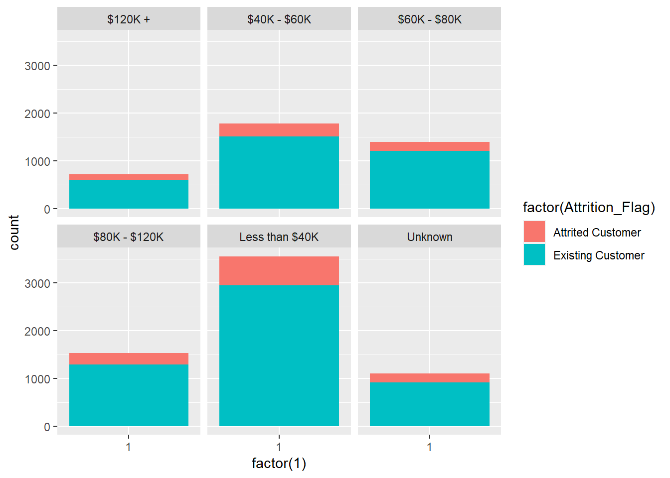 From the graph, we can know that most of the people have less than $40K income. Moreover, if dividing customers into different categories by their annual income, people with less than $40K have the larger amount to close the account. People with $120K + annual income have less amount to close accounts. It seems that there is a relationship between the number of people closing their account in this bank and their annual income. However, the base number of each category is different so a closer look of the proportion of each category is needed.
ggplot(BankChurners)+geom_bar(aes(x=Card_Category,fill=Attrition_Flag))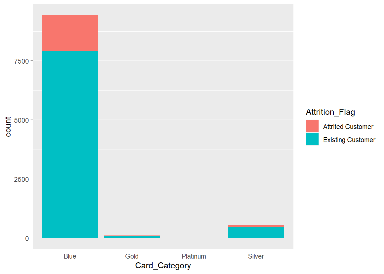 From the plot, we can see that most of the collected data of the card category is blue, which may lead to bias in the final results. Since blue has the most data, it has most existing customers and attrited customers, and platinum seems to have no attrited customer.
ggplot(BankChurners)+geom_bar(aes(x=Marital_Status,fill=Attrition_Flag))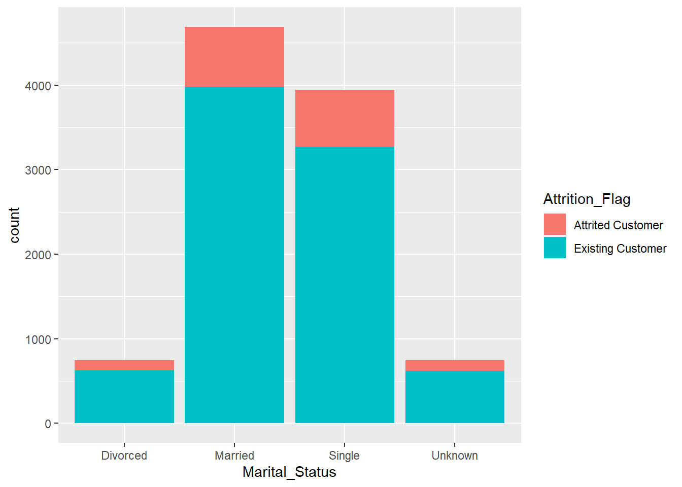 There really doesn’t seem to be a relationship between marital status and the number of people that churned. The attrited customers seem to be evenly distributed around different marital status. So the marital status does not seem to be a liable one.